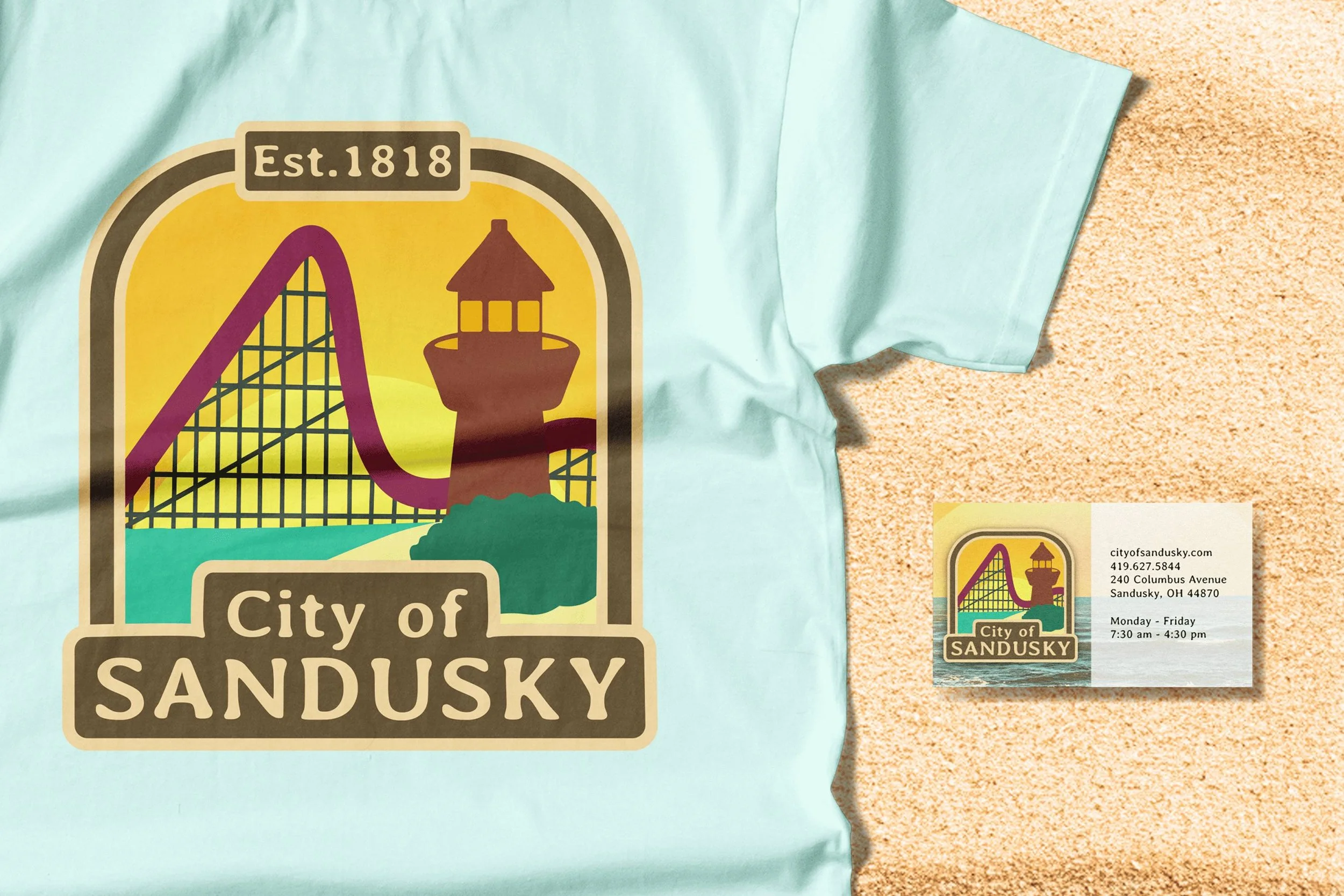
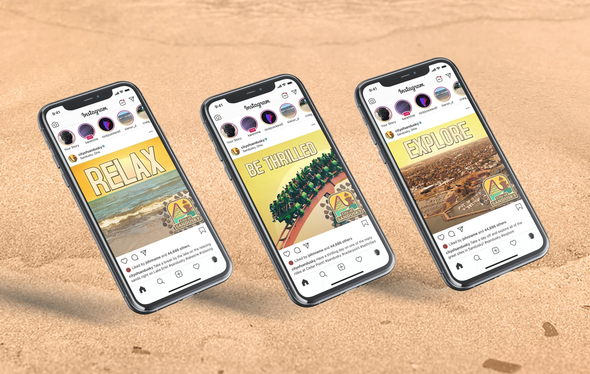
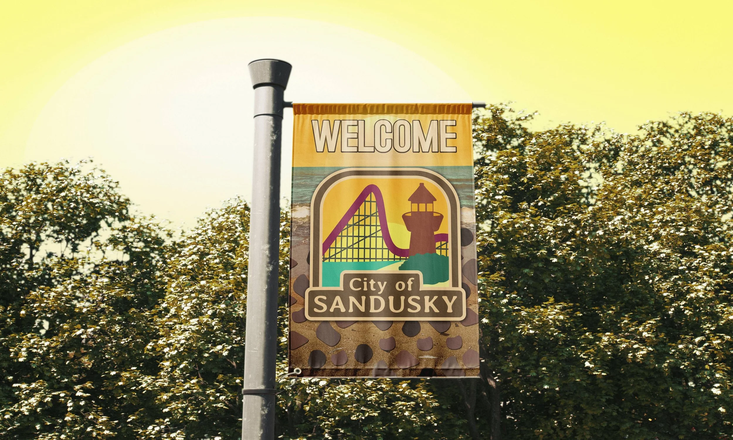
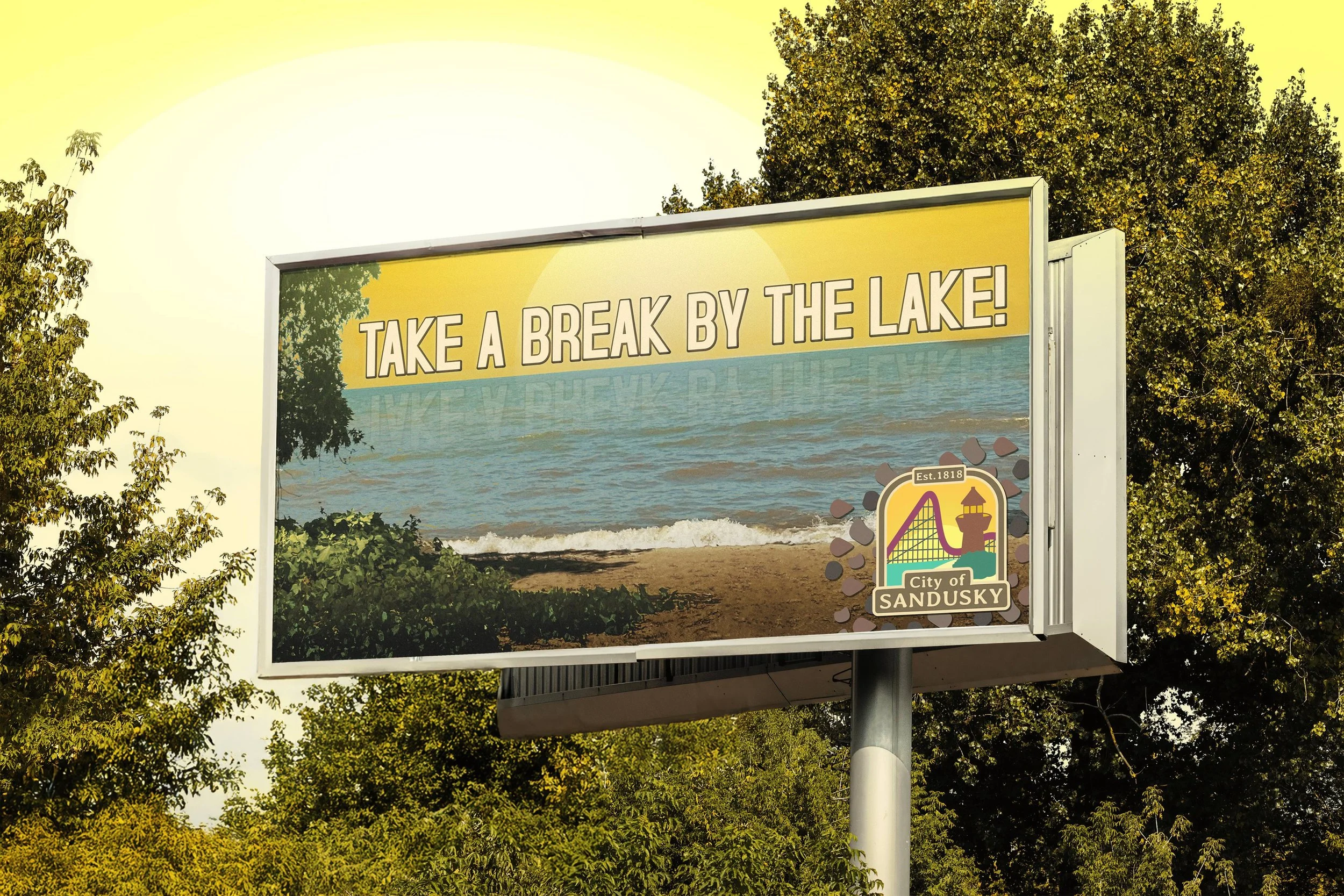
Sandusky City Branding
I redesigned the Sandusky logo to highlight Lake Erie and a roller coaster, representing Cedar Point, all set against a sunset backdrop. The color palette uses brown and tan to give the logo a retro feeling inspired by signs I’ve seen during my own experiences in Sandusky. I also made the logo fit into a square in order to be applied in a wider variety of spaces.